Creating the Stand on the Promises website was like creating a vision. Once I was convinced that this was what the Lord wanted me to do, I put my whole heart into it. I went in search of someone who could represent the dream I had. I wanted to create a website that was warm and welcoming, in a personal way. I am so glad that my search led me to Mrs. Adriana Cal and the RedPoint Web Design team! This has been one of my greatest blessings.
Almost every detail in the logo of the website is symbolic of some truth.
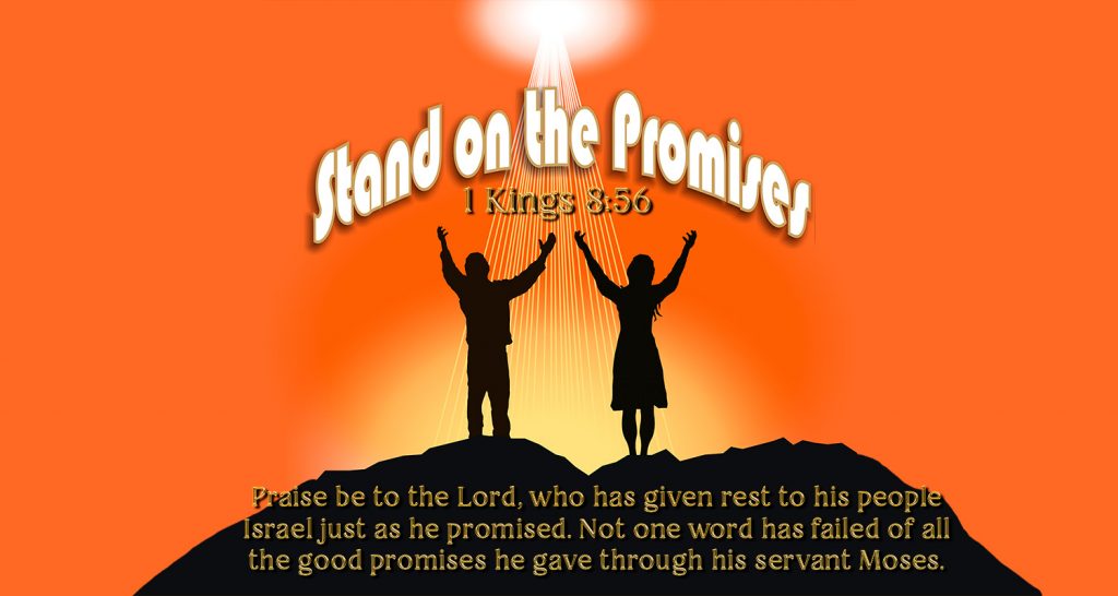
The vision is of two individuals, male and female, representing humanity; standing on the top of a solid rocky mountain with hands upraised in praise to God. The mountain represents the promises of God which have their firm foundation in Jesus Christ, the Rock! What started out as a bright sunny day at the beginning of my dream, turned into an extraordinary sunrise! The changing tones represent the seasons of life (the sunrise of plenty, and the darkness of scarcity); the fact that we live in a changing world, and that no situation lasts forever. They also represent the truth that no matter how dark the night, the sun will rise again! Yet through it all, we can stand on the promises! Through it all, the promises fail not! The rays of light from above represent the presence of the Father who is constantly watching over His people. The “explosion” when you click on the key text, 1 Kings 8: 56, represents the discovery of a gem hidden deep in the Rock: the truth that “not one word has failed of all His good promise…” The color of the letters represents gold, the value of His unfailing promises! The stars were not a part of the original dream, but fit perfectly in the thought, that it is in the darkest of nights that the stars, the creation of His hands, are most appreciated!
These are the people who helped to create the vision:
Adriana Cal, a freelance web designer, is married, and is the mother of Margot. She was born in Uruguay and lived for a while in the United States of America. She has a unique way of capturing the insights of her clients. Her extraordinary ability to combine form and color is a plus to any website. She has an in-depth knowledge of the dos and don’ts of web designing that is absolutely amazing. Her desire to please the client is not only verbalized, but is seen in the way she bends backward to come up with exactly what the customer requests. She can be reached at: adris72@gmail.com
Evita Pena is the Account Representative. Her warm and friendly personality is a plus especially when dealing with clients who are in search of that “special something” that is not so easily articulated. She is an excellent liaison between the company and the client.
Alejandro Todino is the Flash Designer who captured so brilliantly the flashing light, the changing colors from bright to dark, and even added some twinkling stars and the gush of music when you click on the key text in the rock (1 Kings 8: 56). He did a magnificent job of flash animation! Exactly what I asked for, and then some!
Jose Cruz is not a part of the RedPoint Web Design team, but he was the person who finally modified the design for my logo, to my satisfaction. His patience in listening to my dream and continually going back to the drawing board until he got it right will always be remembered with deepest appreciation. Jose is from the Dominican Republic.
Ailil Martinez, my personal friend, was the first person to really capture my vision of the two individuals with hands lifted in praise to God. She also came up with the perfect color of the sunrise, and the fine rays of light coming down from above. Her original design with some modifications by Jose, upon request, resulted in the final logo.